Color Planning for Rock Painting: Choosing Palettes That Work
Use a color wheel to pick three or four colors that work together on a painted rock: neighboring, opposite and evenly spaced palettes, plus contrast and mixing tips.
Most painted rocks that look muddled have a color problem, not a drawing problem. Six bright colors used in equal amounts compete with each other, and even a neatly painted design gets lost. Choosing three or four colors before opening any paint solves most of it.
A color wheel makes the choosing quick. It shows which colors sit quietly together and which ones push against each other, and three simple schemes taken from it cover nearly every stone.
How the color wheel is arranged
A twelve-segment wheel is built from three groups:
- Primary colors: red, yellow and blue, spaced evenly around the wheel.
- Secondary colors: orange, green and violet, each sitting between the two primaries that mix to make it.
- In-between colors: the six mixes of a primary and its neighbor, such as yellow-green, blue-green (teal) and red-orange.
One half of the wheel, from red through orange to yellow, is called warm. The other half, from green through blue to violet, is called cool. Warm colors tend to look closer and livelier; cool colors tend to look calmer and farther away.
Three palettes that work
Neighboring colors
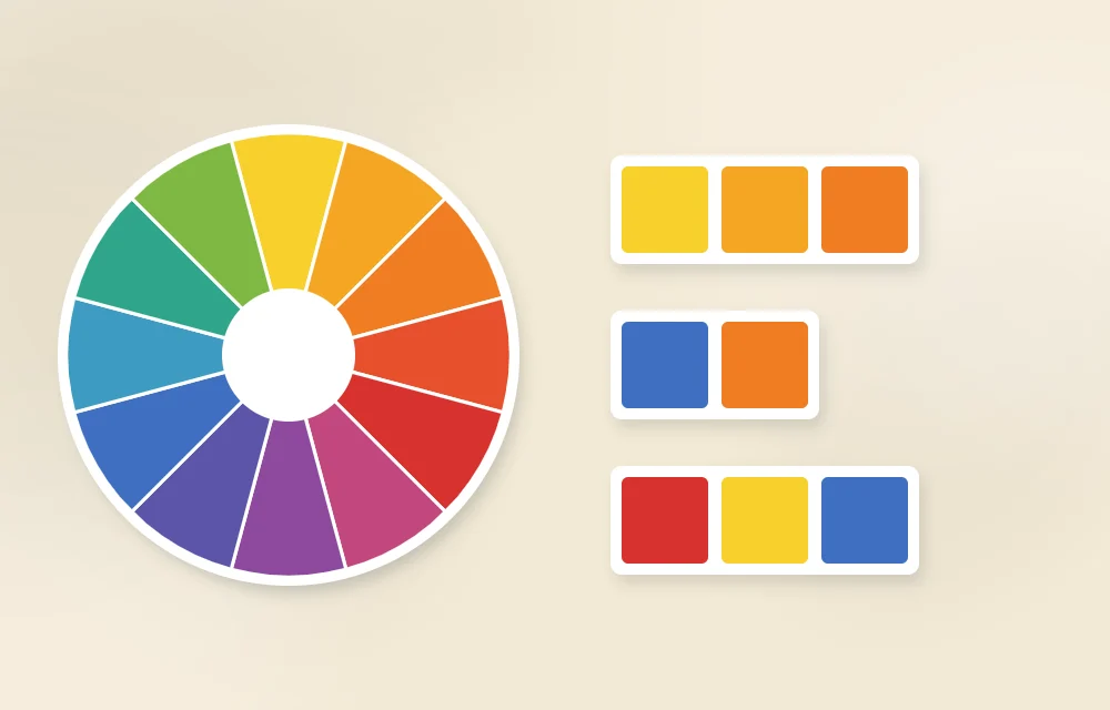
Pick two or three colors that sit side by side on the wheel, such as blue, teal and green, or yellow, orange and red-orange. Neighbors blend smoothly and are very hard to get wrong, which makes this the safest scheme for a first stone. The risk is flatness: without a light or dark accent, the design can look like one soft blur. Add white, cream or a deep navy to give it an edge.
Opposite colors
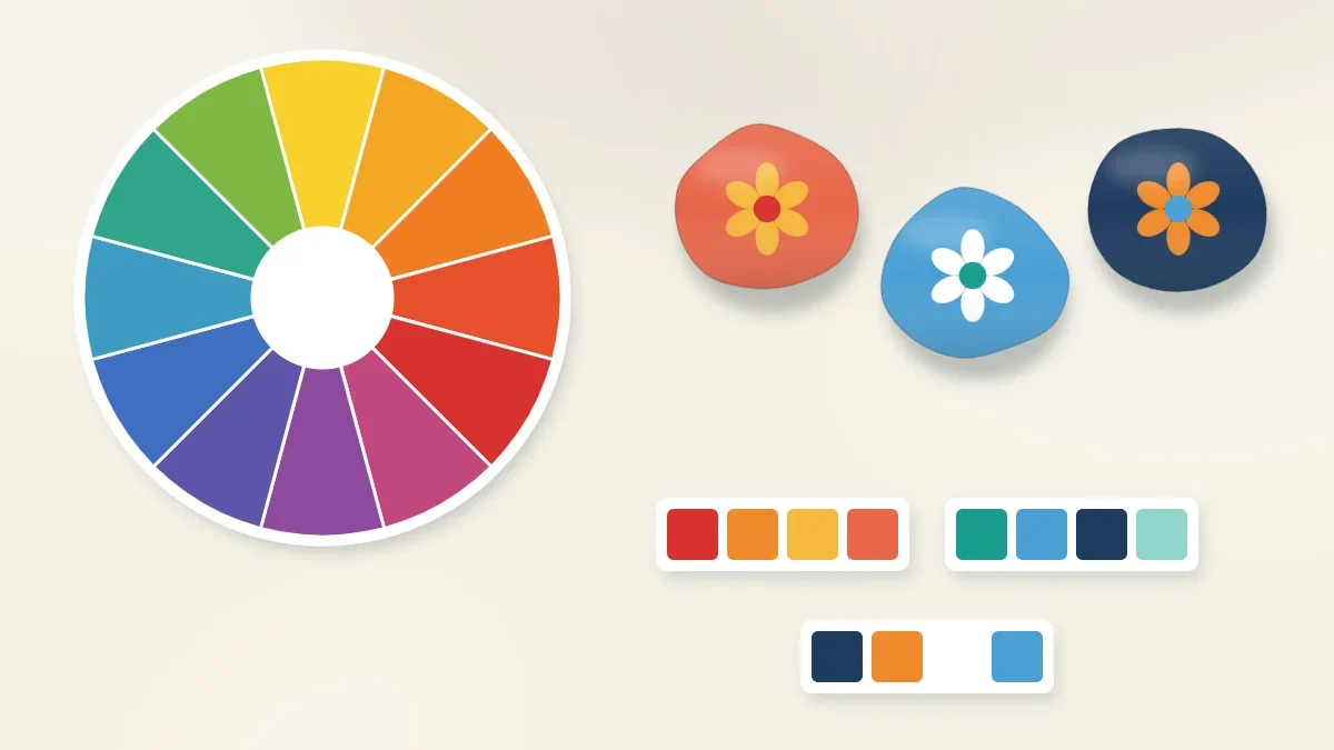
Colors directly across the wheel from each other, such as blue and orange, red and green, or yellow and violet, make each other look brighter. A small orange flower on a blue stone will stand out more than on any other background. Use opposites unequally. Let one color cover most of the stone and use the other as the accent; in equal amounts they can seem to vibrate.
Three evenly spaced colors
Take every fourth color on the wheel, for example red, yellow and blue, or orange, green and violet. The result is lively and balanced, good for playful designs. It is also the easiest scheme to overdo, so choose one of the three as the main color and keep the other two for smaller shapes.
| Scheme | How to find it | Example | Mood | Watch for |
|---|---|---|---|---|
| Neighboring | Two or three colors side by side | Blue, teal, green | Calm, harmonious | Low contrast; add a light or dark accent |
| Opposite | Two colors directly across the wheel | Blue and orange | Bold, high contrast | Equal amounts can clash |
| Evenly spaced | Every fourth color | Red, yellow, blue | Lively, playful | Too busy unless one color leads |
Light and dark matter as much as color
Two colors can be different on the wheel and still blur together if they are equally light or equally dark. Medium red next to medium green is the classic example: opposite colors, yet hard to tell apart from a distance. What separates shapes clearly is a difference in lightness.
A quick test is to squint at your paint swatches. If two neighbors merge into one gray patch, lighten one with white or darken the other. For the same reason, white, black and cream are worth adding to any palette. They are neutral, so they do not count against your three colors, and they supply the lightest and darkest notes that make a design readable.
Use colors in unequal amounts
A reliable split is one main color for most of the stone, usually the background, a second color for the main shapes, and a third used sparingly for small details. Roughly, think of it as most, some and a little. The smallest amount should be the brightest or most contrasting color, because a strong accent only works when there is not much of it.
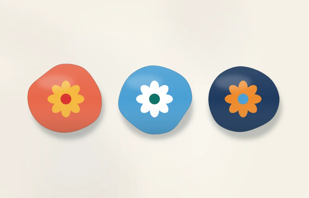
Painting one design in several palettes shows how much color changes the result. A flower in reds, oranges and yellows feels sunny. The same flower in blues, teals and violets feels cool and quiet. In a pair of opposites, the flower jumps away from its background. It is a useful exercise: pick a simple motif from the tutorial on painting flowers on rocks and paint it three times.
Plan before you paint
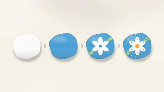
- Choose the background. It covers the most area, so it sets the mood. Dark backgrounds make bright colors glow; pale backgrounds feel fresh and open.
- Pick a scheme. Use the wheel to add one or two colors: neighbors for calm, an opposite for punch.
- Add a neutral. White for highlights and dots, or a dark for outlines.
- Swatch it. Paint small patches side by side on scrap paper, or on a spare stone already coated in your background color. Colors look different on a dark base than they do in the pot.
- Adjust. If the swatches look harsh, soften one color with a little white. If they look dull, swap one color for something lighter or brighter.
Tip
Let swatches dry before judging them. Many acrylic craft paints dry slightly darker than they look when wet, so a wet swatch can mislead you.
Mixing with a limited set
A small set of paints goes a long way once you mix. Red, yellow, blue, white and black will produce every color on the wheel, although mixed greens and violets are often softer than ready-made ones.
- Add white to make a tint, which is lighter and softer.
- Add a very small amount of black, or of the opposite color, to make a deeper, more muted shade.
- Mix more than you think you need. Matching a custom color halfway through a stone is difficult.
- Always add the dark color to the light one a little at a time. It takes very little dark paint to change a light color.
Watch out
Mixing two opposite colors in roughly equal parts gives brown or gray. That is useful for stems, soil and shadows, but it is also why a brush that was not rinsed between opposites turns everything muddy.
Bright colors on dark stones
Yellow, orange, pink and light green are often see-through, so they look dull painted straight onto a dark stone or a dark base coat. Paint the shape in white first, let it dry, then put the color on top. The white underlayer is explained with examples in the guide to layering paint on rocks.
Where to practice
Patterns are the easiest place to try a palette, because the design stays the same while only the colors change. Stripes, zigzags and scallops need just two or three colors, and dot painting shows off contrast between a dark base and bright dots. When several stones will be shown together, one palette across the whole set is what ties them into a group, as described in the guide to displaying painted stones at home.
Frequently asked questions
How many colors should I use on one painted rock?
Three or four colors plus white or black is a good limit for most designs. Fewer colors used in unequal amounts usually look more planned than many colors used equally.
Which colors look good together on rocks?
Colors next to each other on the color wheel, such as blue, teal and green, give a calm result. Colors opposite each other, such as blue and orange, give strong contrast when one is used as a small accent.
Why do my colors turn muddy when I mix them?
Mixing colors from opposite sides of the wheel, or mixing more than two or three colors together, produces brown or gray. Rinse the brush between colors and mix only neighbors when you want a clean, bright result.